- Mike Sierra
Principal Product Designer
UI Design
UX Design
Visual Design
User Research
Marketing Design
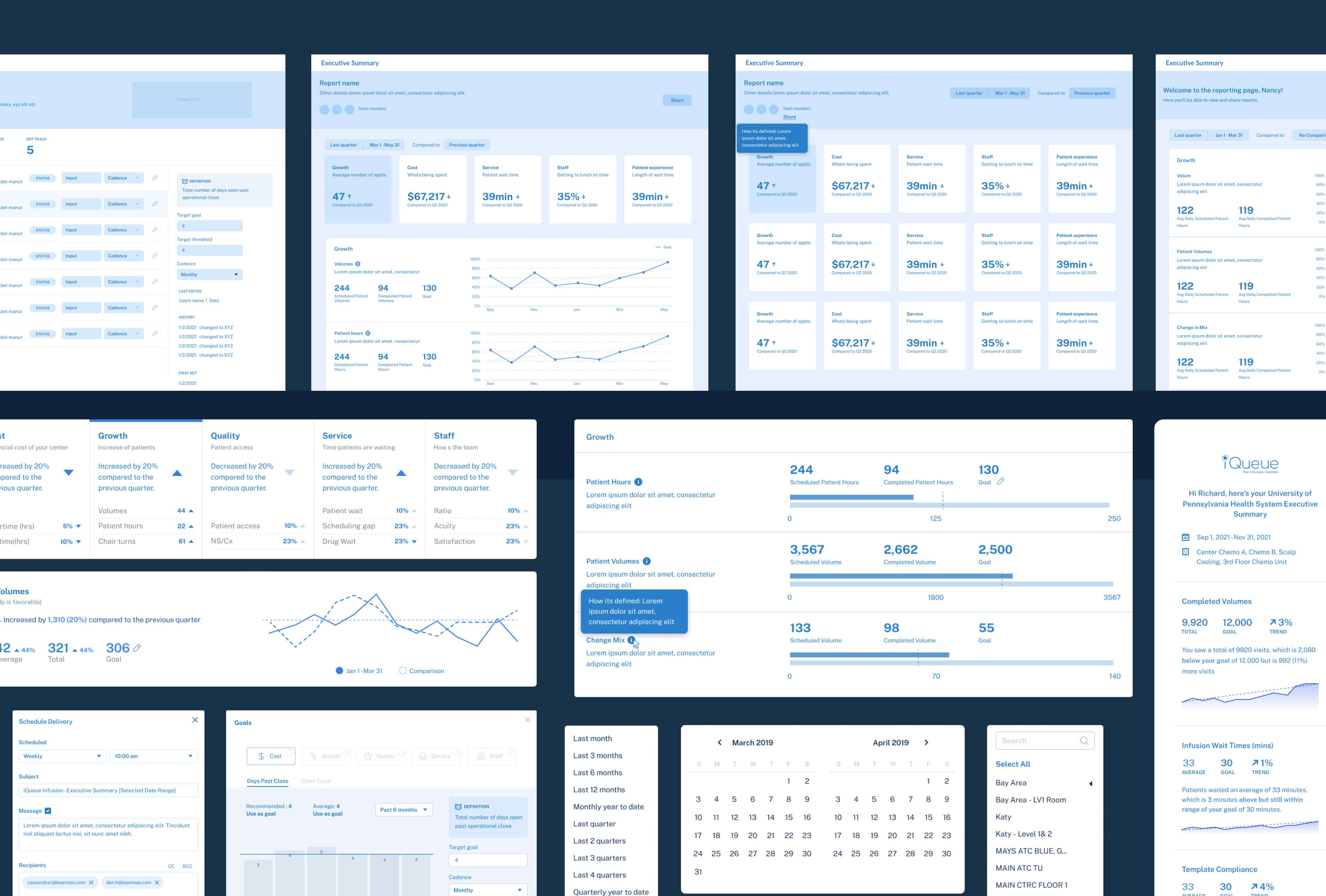
Interface design and visual design for entire end-to-end product experience. Gathered information on problem space, solution and design workflow to ensure the best, comprehensive product experience. This revolved around simplifying complex data insights into easily digestible stories. Designed the end to end experience, from marketing materials to notification emails and all product views and interactions. The designs workflow was created to encompassed an easy and pleasant experience from start to finish.
Partnered with University of Cincinnati Medical Center to ensure data insights were meaningful and relevant, to allow chemotherapy center managers to ensure the success of their center(s).
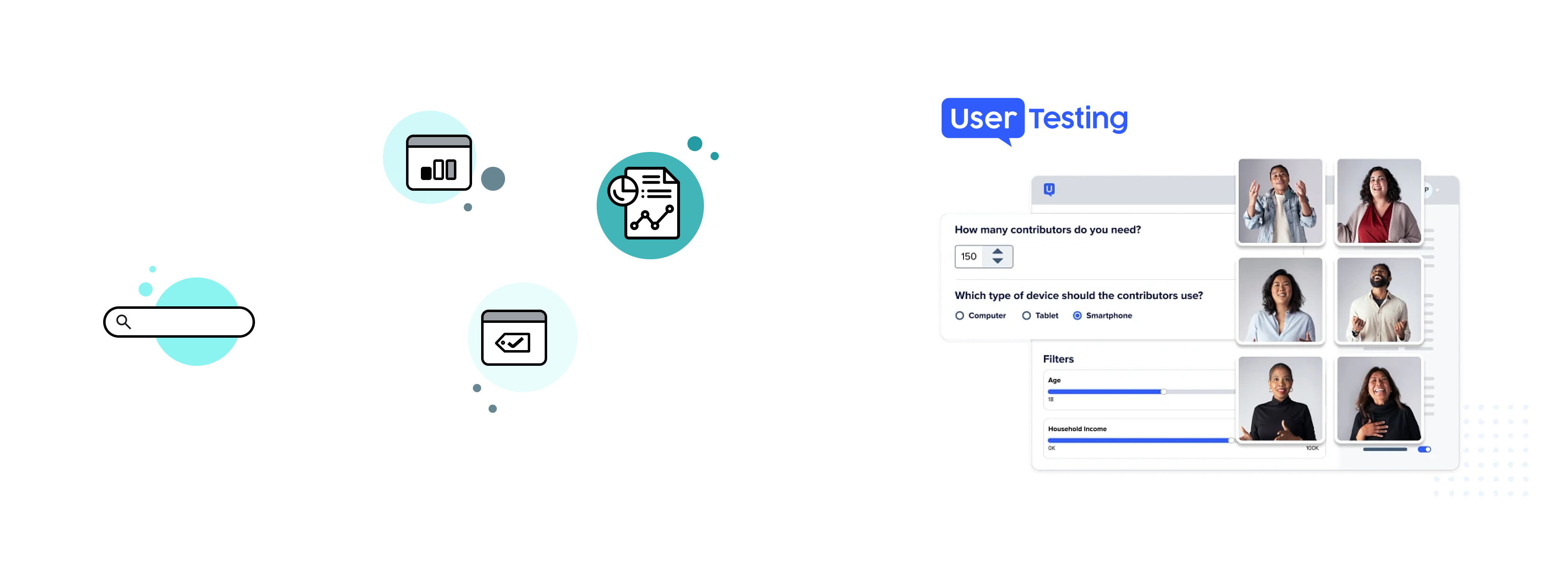
Ran over 20 user interviews to ensure user experience allowed for the most complete and understanding of workflows. Also utilized the UserTesting.com platform for more quantitative UX feedback.
Post product launch, tracked and measured specific KPI’s to help inform future improvements.
Business outcomes that were achieved from this new product release: Reduced report generation time from hours to minutes, enhancing decision-making efficiency, grew application usage for the center manager and VP/Director persona.
Chemotherapy infusion center managers lack a single platform that pulls together all their EHR data and analyzes it into a comprehensive story. Instead, they typically spend hours each month manually combing through different sources to find the right data, doing an analysis, then producing homemade insights. Without these readily available insights, these managers struggle to make data driven decisions that allow them to get a pulse of their centers overall health.
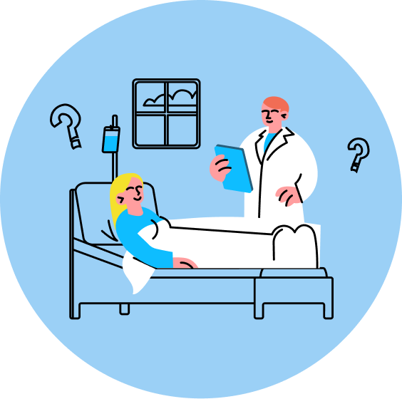
Infusion center managers need this data to make strategic decisions, identify or bypass potential operational issues, navigate staffing challenges, and protect vulnerable patients. But creating reports that actually provide useful, relevant, and actionable information, for executives who usually oversee several centers at one time, is harder than it sounds.
During COVID, when chemo centers severely reduced staffing and higher patient acuity caused by deferred care, infusion center managers must still regularly produce executive-level reports to update their leaders on their center’s performance.
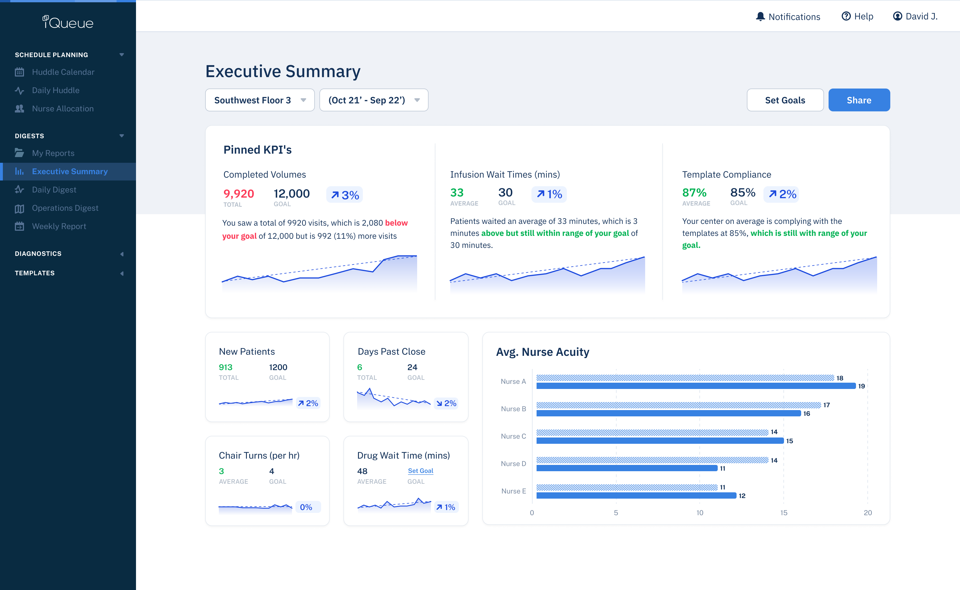
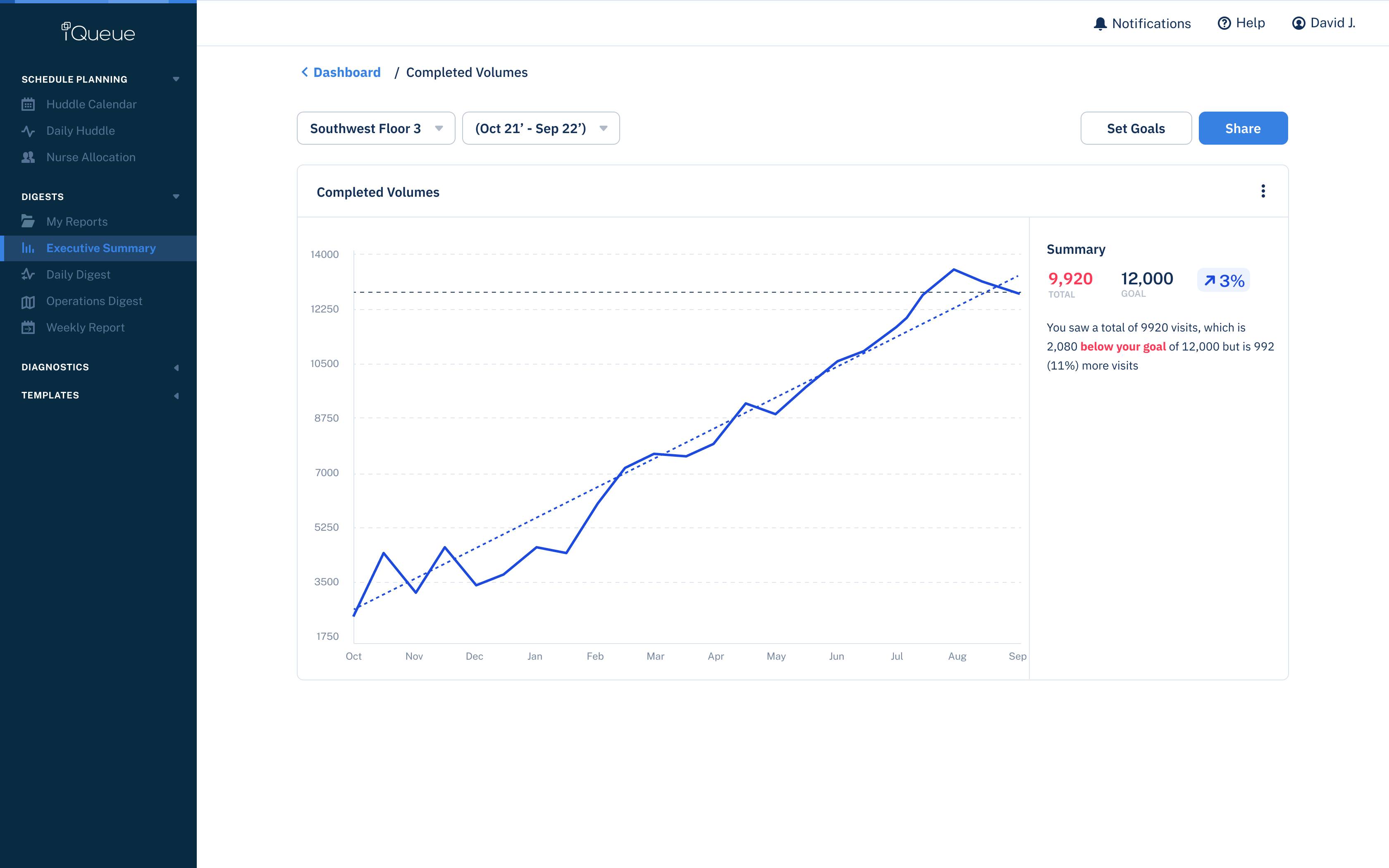
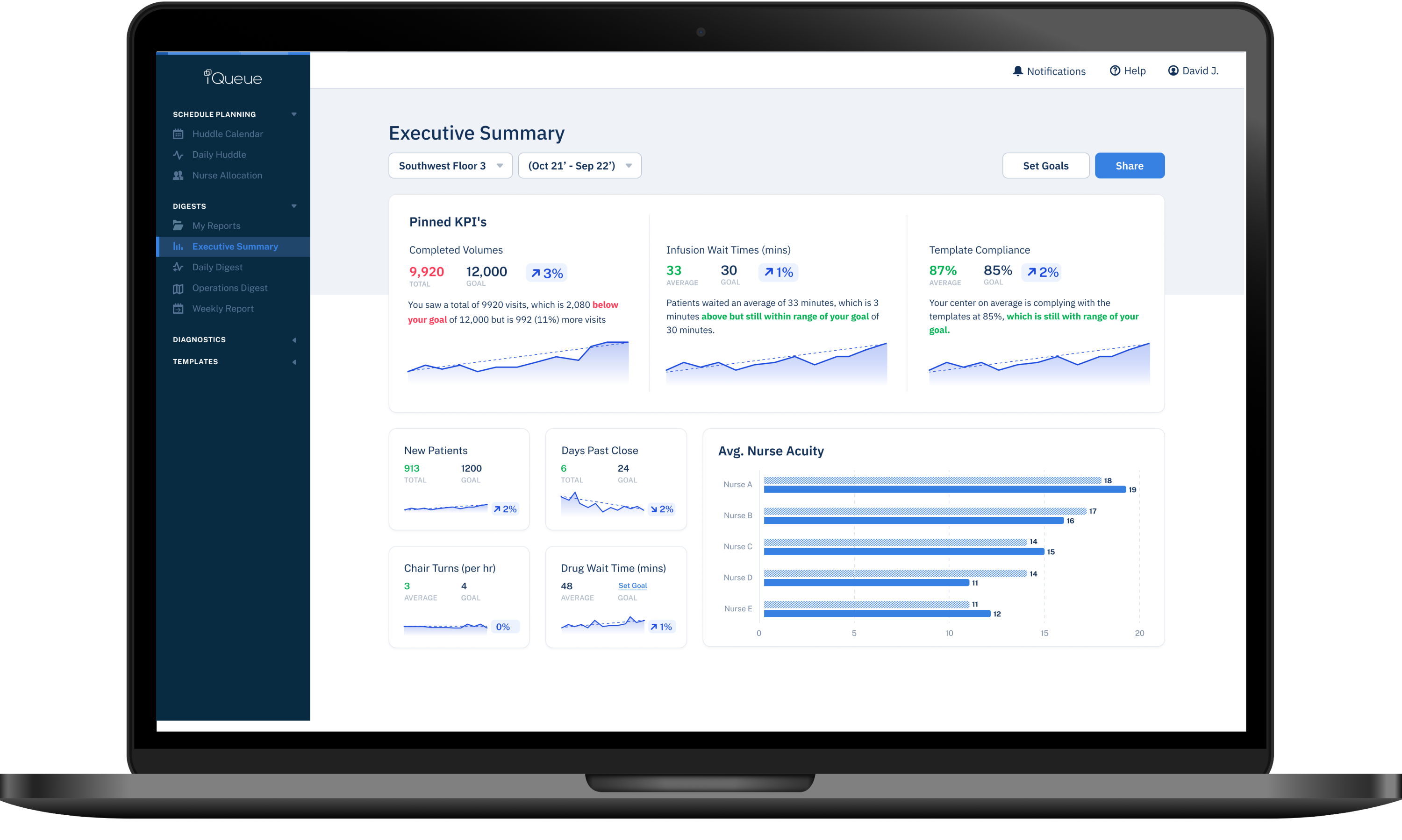
Executive Summary allows infusion center managers, who previously struggled for hours or days to generate comprehensive reports, to both produce easy-to-digest yet actionable reports within minutes and engage with their executives on timely data that truly matters to them.
We partnered with the University of Cincinnati Medical Center to ensure our data insights, design flows, and interfaces were meaningful and relevant. This would help us create designs that best served chemo center managers, allowing them to be successful at their jobs.

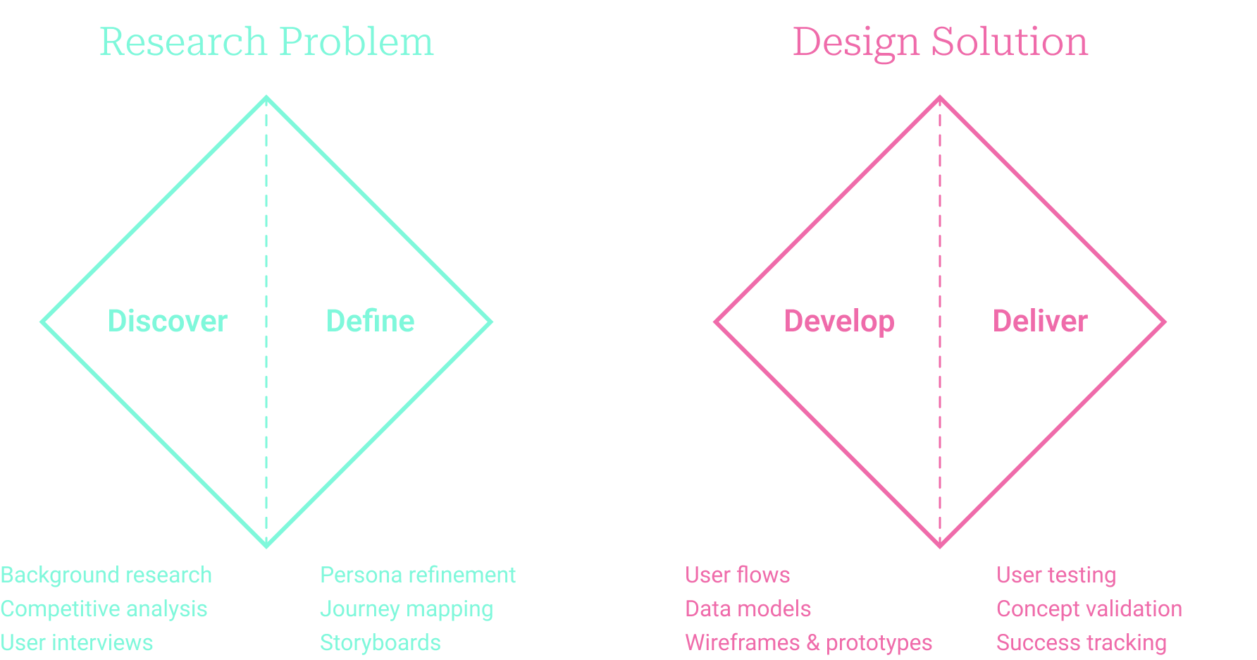
Utilizing the double diamond method allowed for a structured design approach, that divides the design process into four distinct phases: Discover, Define, Develop, and Deliver provided me a framework for creative problem-solving, ensuring thorough exploration and refinement of ideas before arriving at the final solution.
User Interviews
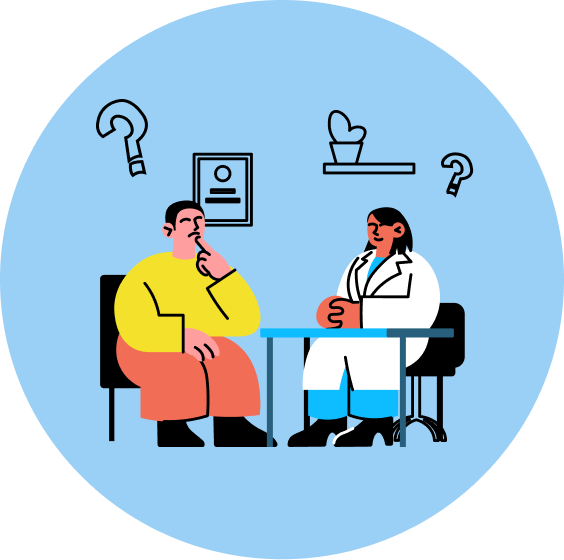
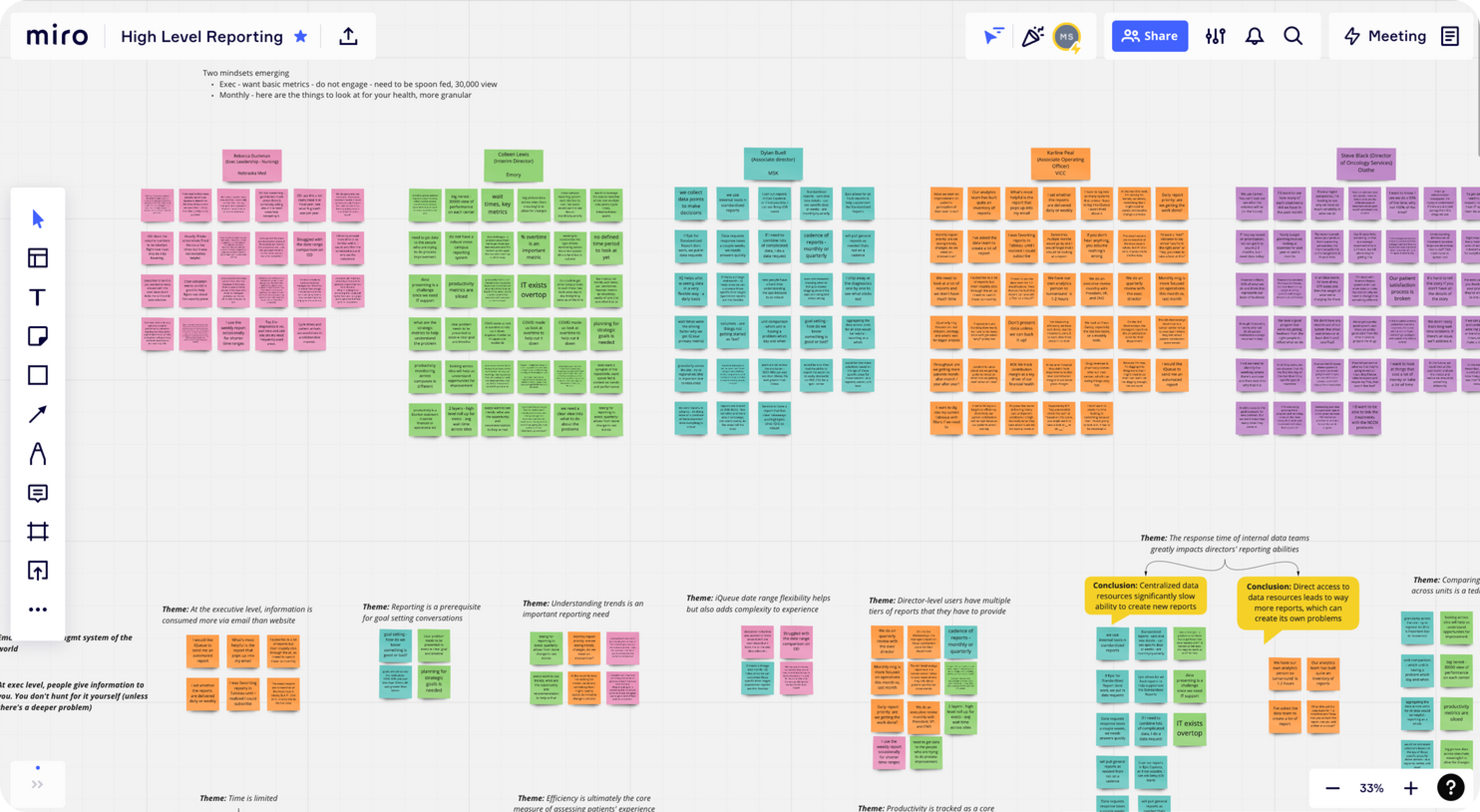
Conduct over 20 user interviews with different healthcare institutions. These varied from larger, multi level cancer centers like New York Presbyterian to smaller centers with only 20 chemo chairs.
Compiling similar pain-points across multiple institutions allowed me see patterns of need to help inform how and what to solutionize in the designs. Creating themes allowed me to understand where the need resided, who was experiencing it, and at what frequency across our customer base.
Journey Mapping
Developing user journey mapping to enhance understanding by visualizing our users experiences, needs, and pain points, allowing us to empathize with and address user challenges effectively. It helped to identify opportunities for optimizing user touchpoints and streamlining processes, ultimately resulting in a smoother user experience and increased customer satisfaction.
We found it also improved collaboration among cross-functional teams by providing a shared perspective on the user experience, leading to more informed and user-centered design decisions.
Competitive Analysis
Creating accounts and utilizing other data and healthcare platforms allowed us to see what other tools offered in the market, how they displayed their data, and other potential product and UX opportunities our new offering could bring to the market.
Many of these tools required a deep understanding of reporting and analytic tools with steep learning curves, require complex data preparation, and require advanced feature expertise.
Persona Refinement
As we interviewed our users, we continued to refine and discover more about their usage patterns, needs, and wants. We discovered that the Hospital Director persona was under served and didnt fully utilize the platform. As a key decision maker in the renewal process, we came to understand that showing value to these users was extremely important.

“I don't want to wait for a long time to start my appointment. I want to have a quick and pleasant experience as possible."

“I need to make sure my center is running smoothly, and if not why. I need data to help inform my decision making, and to bring to leadership."

“I don't have time to read long reports. I need to know how well my centers are running to ensure the hospital is being managed correctly."
Gathering all the data to tell a cohesive, meaningful story takes a lot of time and effort. Center managers have to rifle through many different sources to gather in the information, then create a meaningful story behind it.
Our PM team members are an integral part of the customer experience. They also spend a great deal of time helping with this task.
Through multiple research sessions, we came to understand there are a set of data points that are top of mind: Patient Wait Times, Number of Completed Appointments, and Template Compliance (how well is the center complying with our recommended mixture of patient to nurse to appointment start time ratio).
During our research sessions, we learned that not only was the Hospital Director not utilizing the platform as frequent as we’d liked, but was a key player when making financial around when it came to LeanTaaS’s yearly renewal.
We now understood that getting the value of easily digestible reporting tools into these users hands was crucial to both theirs and ours success.
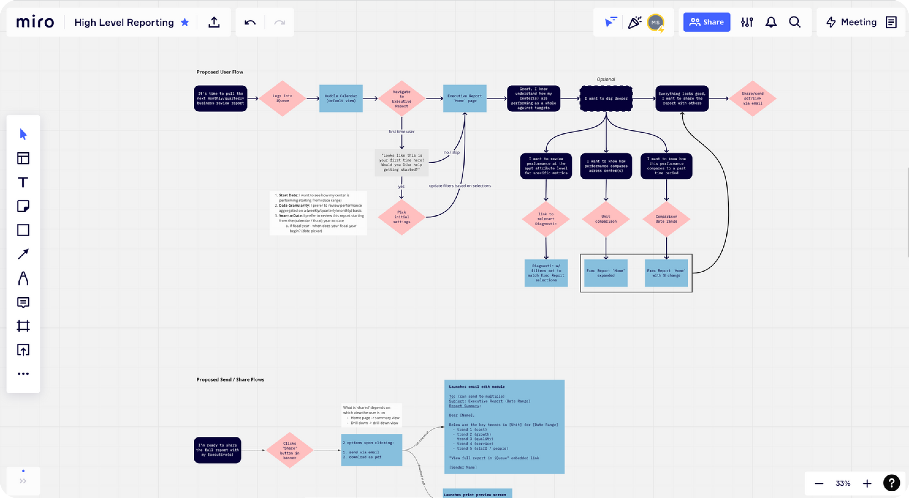
Countless wireframes and prototypes were created to ensure we could test and iterate on concepts with our users. Ensuring we had clear and concise feedback from our users was important to understanding if what we were designing was going to successfully complete the needed goals of our users.
Wireframes were created for main screen, data cards, different chart types, drop downs, share features, calendar components, emails and notifications. It was important to ensure all pieces of the interface created a clear and cohesive experience.
Prototype Testing
I conducted over 15 user feedback sessions. With minimal hand holding, I had users attempt to complete specific flows then followed up with discussing the exercise.
These findings were then used to continue to iterate on designs that allowed me to narrow down what data was important to display, which workflows were most intuitive, and shape the overall experience of the Executive Summary.
I also utilized the Usertesting.com platform for additional feedback. This tool allowed me to test against large subsets of specific user to complete specific tasks in a quick and easy way. It allowed for insights into naming conventions, placement of CTA’s and overall feedback on feel of experience.